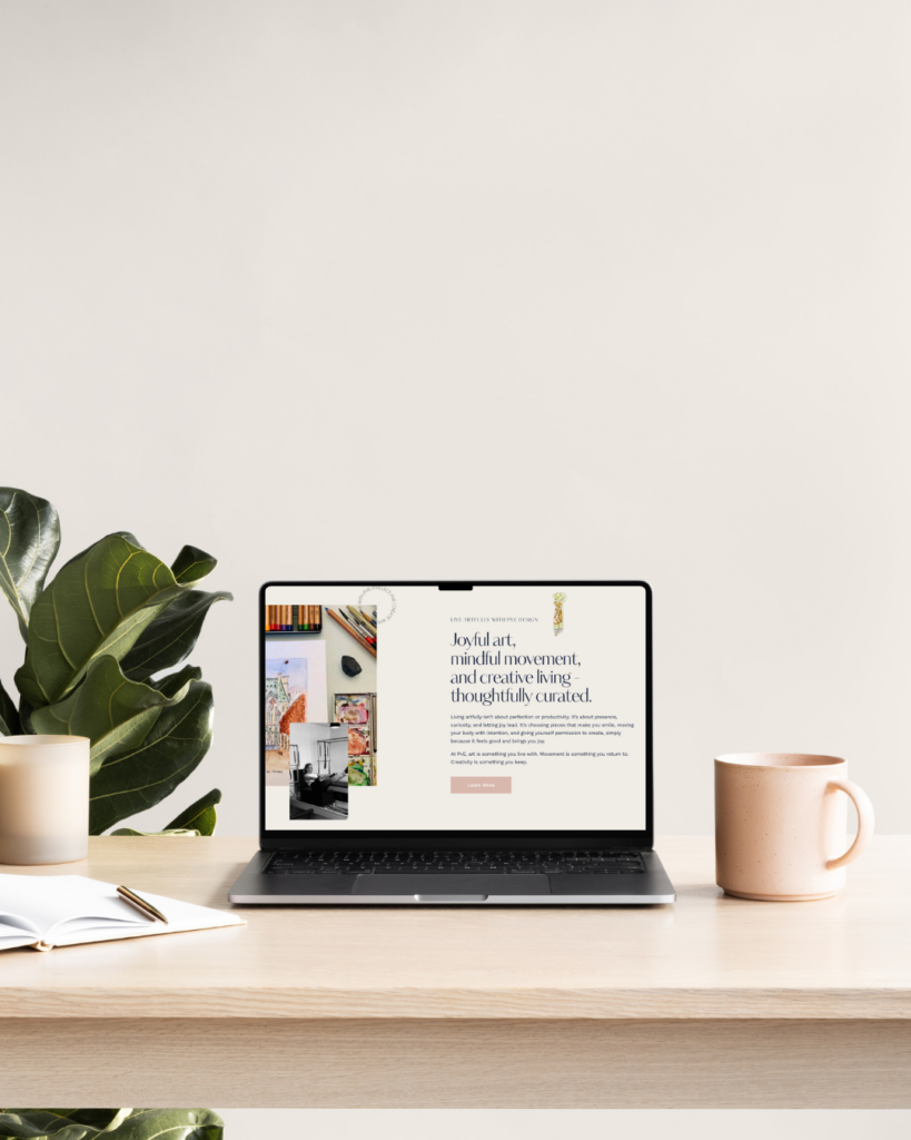
How a full rebrand and ground-up website rebuild gave artist Patricia van Essche one cohesive home for her artwork, Pilates practice, and creative collaborations.
Hi friend,
The Client
Patricia van Essche is an artist, illustrator, and Pilates instructor whose work spans original paintings, prints, stationery, custom pet and lifestyle portraits, brand collaborations, and mindful movement coaching. Her clients range from individual collectors to global brands, and her audience finds her through Etsy, social media, in-person collaborations, and direct referrals.
She doesn’t do one thing. She does several beautifully connected things, and her old website wasn’t telling that story.

Where She Started
Patricia had a website. It worked, technically. But it had grown the way most multi-passionate creative businesses’ sites grow over the years: in layers.
A page added when she launched a new service. A gallery tucked behind a menu item. Pilates living in one corner, artwork in another, and the philosophy that connected them, Live Artfully, never fully landed on the page.
The result was a site that asked visitors to do the work of figuring out who Patricia was and what she offered. For a brand built on joy, whimsy, ease, and intentionality, that was the opposite of the experience she wanted her audience to have.
She was ready for a rebrand and a rebuild from the ground up.
The Goal
We set out to build a brand and website that could hold all of Patricia’s worlds without making any of them feel like an afterthought.
- Unify the brand under a single, clear philosophy that reflected who Patricia is and how she works
- Develop a complete visual identity: primary logo, secondary mark, submark, color palette, typography system, and brand guidelines, so every touchpoint felt unmistakably hers
- Make the multiple revenue streams legible: artwork, Pilates, portrait commissions, and brand collaborations without forcing visitors to choose between them
- Integrate her Etsy shop so browsing felt seamless and you could fully see her work
- Create a home for her voice that felt as warm, curious, and joyful as Patricia herself
- Build on a platform that gave her flexibility for future growth without locking her into a template
The Strategy
Before we touched a single design file, we did the brand work.
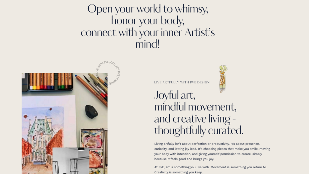
Patricia already had the language , Live Artfully, but it was sitting in her head and her conversations, not on her site. The first job was to pull that philosophy out and let it become the spine of everything: the way the site is organized, the way services are described, the way the homepage greets a first-time visitor.
From there, the structural decisions got easier. Instead of building a site that asked, what do you want to buy?, we built one that asked, how do you want to live? The homepage leads with the philosophy and the services flow from it. The shop is integrated, not hidden. Every page reinforces the same idea: this is a place where art, movement, and creativity belong together. Another aspect about Patricia is that no matter how many designers or partners she’s worked with, she has always been willing to listen to the rationale behind a decision and to take the time to learn. We have worked with clients who ask for something and only want it their way. Not her, and that was a big sticking point.
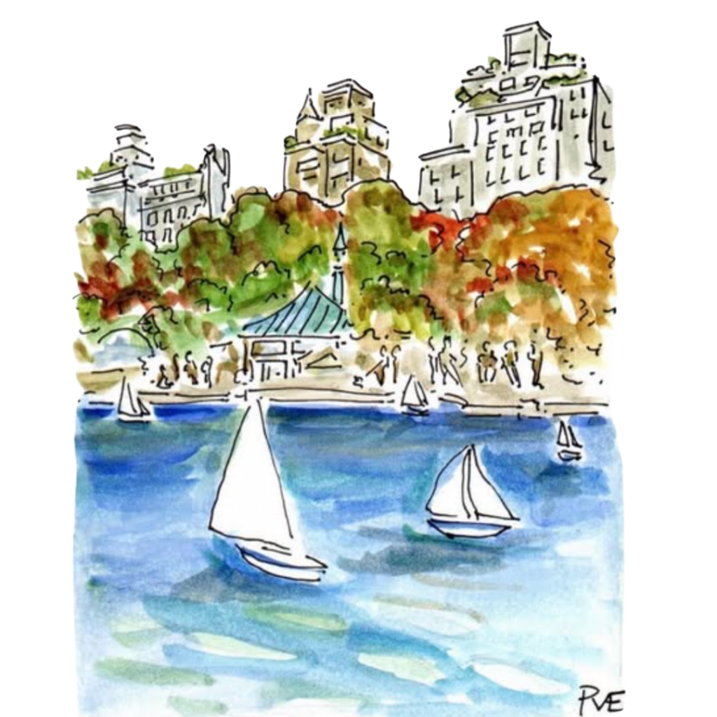
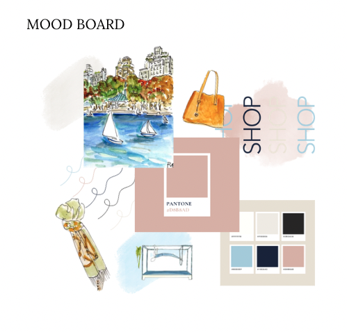
For the visual identity, we leaned into what was already true about Patricia’s work: economy of line, thoughtful color, an effortless elegance that doesn’t try too hard, and, most importantly, leaving space for the whimsy. The branding had to feel like her artwork: refined, joyful, and unmistakably PvE.
The full brand suite was designed to flex across every place Patricia shows up, which is on gallery walls, Etsy listings, Pilates studio instruction, brand collaboration decks, social media, and her website. That meant a primary logo for the front-facing brand and a secondary mark for tighter applications. Add in a defined color palette, typography system, and a brand guidelines document, and Patricia walked away with everything she needs to stay on-brand whether she’s launching a new print collection or pitching a brand partner.
The Build
The rebuilt site lives on WordPress, chosen for the flexibility Patricia needed across products, services, and her always-growing portfolio.
Highlights of the build:
- A complete brand identity suite: primary logo, secondary logo, color palette, typography system, and brand guidelines PDF
- A homepage that opens with intention, not a sales pitch, but an invitation to slow down and look
- A gallery-forward shop section that integrates directly with her Etsy listings, so collectors can browse without breaking the spell
- Service pages for each offering, including Pilates, custom portraits, courses, and creative collaborations. Each with its own clear path to working with Patricia
- Stories from clients she’s worked with or students she’s taught through her art coursework or Pilates, telling their story of how PvE changed their bodies and improved their crafts
Every page was designed to feel like walking through a curated studio rather than just clicking through a catalog.
The Result
The new PvE Design site does what a multi-stream creative brand’s site should do: it lets each offering shine without making visitors feel like they’re flipping between businesses.
Patricia now has a home base that:
- Tells one cohesive story instead of several disconnected ones
- Sends visitors to her Etsy shop without losing them
- Makes it easy for brands and individuals to inquire about collaborations and commissions
- Reflects the brand voice she’s been whimsically living for years
And because the foundation is strategic, not just visual, the site can grow with her. New offerings, new collaborations, new directions… all of it has a place to land.
What This Means for You
If you run a creative business with multiple revenue streams, and most artists, designers, and wellness providers do, you don’t need a separate site for every offering unless you have a separate wholesale pricing framework that can’t live within what’s visible. You need a single brand home built around the why underneath all of them.
The temptation is to organize a site by what you sell. The better move is to organize it by what your audience is trying to feel, do, or become. When the philosophy leads, the services follow naturally and your site stops doing the work of explaining you and starts doing the work of welcoming people in.
That’s the kind of site that turns visitors into collectors, students, and clients.
Ready for a brand and website that hold all of who you are? Schedule your free discovery call with Boomerang Collective →