So you built your own website.
You did the research. You pieced it together between client calls, coffee runs, and late nights. And if we’re being honest? You deserve some serious credit for launching something on your own — because that’s no small feat.
But now that it’s live, something doesn’t feel quite right. Maybe people aren’t booking like you expected. Maybe it feels off-brand, or you’re starting to second-guess your layout, copy, or overall vibe. And suddenly, you’re asking yourself the dreaded question:
“Do I need to start over?”
The answer? Not necessarily.
A lot of DIY websites fall into the same five traps — and the good news is that most of them are totally fixable. No need to toss your site in the trash and go back to square one. A little refinement can go a long way.
Let’s talk through five of the most common DIY website mistakes — and how to fix them without burning it all down.
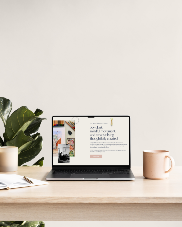
1. You’ve Got Either Way Too Much Copy… or Almost None at All
DIY websites tend to go one of two ways: either there’s way too much writing (because you’re trying to say everything at once), or there’s almost none — leaving your visitors confused about what you offer and where to go next.
If your site has giant paragraphs no one’s reading, or if your homepage has only a few vague lines of text that don’t give people much to go on, you’re likely losing their attention pretty quickly.
How do I think you can fix it? Focus on clarity over creativity. Make sure it’s immediately obvious what you do, who it’s for, and how to work with you. Clean, punchy sections with clear headlines and direct calls to action are your best friend. You don’t have to be a professional copywriter — you just need to be clear and concise with the content you develop.
2. Your Branding Is Inconsistent Across Pages
In the DIY process, it’s super easy to play with different fonts, colors, and graphics on every page of your website and throughout your social media. But that inconsistency makes your brand as a whole feel scattered and unprofessional — even if your actual business is anything but those things.
If your homepage feels pastel and minimal but your About page feels bold and saturated… that’s a disconnect. And in branding, consistency is what builds trust.
So, how do you clean it up? Choose two or three main colors, one or two fonts, and stick to them everywhere. Use high-quality versions of your logo, and check to make sure it looks clean on both desktop and mobile. If you don’t have a brand guide yet, now is the best time to make one (better yet, reach out to our team — we’ll help you build one that actually supports your business long-term).
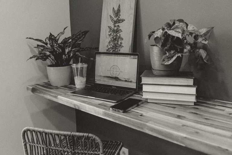
3. It Doesn’t Work Well on Mobile
This is a big one and one that really grinds my gears when I see that it got missed. You may have built your site on a desktop — but if you’re not optimizing for mobile, you’re likely missing out on a huge chunk of traffic. Slow load times, weird overlapping elements, and buttons that are too small to tap…you know you’ve experienced how annoying that feels, and that’s an automatic “hard pass” for many users.
To fix this you should compress any oversized images (tools like TinyPNG are great), preview your site on both tablet and phone, and make sure all clickable buttons are clearly visible and easy to use. Most DIY platforms like Showit or Squarespace have built-in mobile previews, so be sure to check both versions before publishing any updates.
4. You Don’t Have a clear Call-To-Action…anywhere
You might have a beautiful site — but if you’re not telling your audience where to go next, they’re likely to just click away. Your site needs clear direction, and here are a few CTA phrases to help:
- Book Now
- Contact Our Team
- Get in Touch
- Contact Me
- Sign Up Today
- Purchase Now
- Get it while it’s hot
- Let’s Get Started!
DIY sites often forget that your website isn’t just a digital flyer — it’s a guided experience. Visitors shouldn’t have to guess what to do after they decide they’d love to work with you or purchase your products. They should be gently (and confidently) led to the next step.
A few questions you should ask yourself: What do I want someone to do when they land here? Is that obvious? Is the path from page to page intuitive? If not, it’s time to clarify that flow. Add buttons, underline links, and make their next step easy to take.
5. You’re Stuck in DIY Fatigue — and It Shows
You’ve updated the homepage fifteen times. You’ve changed the fonts three times in one week. You’ve stared at your About page for so long that words have lost all meaning. That exhaustion? That frustration? That’s DIY fatigue — and it’s so real, girlie pop.
That doesn’t mean you have to start all over again.
In fact, this is usually the stage where a professional audit or semi-custom refresh can help the most. You’ve done the work. Now you just need someone to come in with fresh eyes, real strategy, and a creative approach to bring it all together.
Sometimes, you don’t need a brand new site — you just need someone to tighten the design, refine the messaging, and clean up the experience. That’s what we do best at Boomerang Collective Co.
You Don’t Have to Do It All On Your Own
If this list made you nod (or cringe) — you’re not alone. These are the most common website struggles we see, especially for makers, service providers, and small business owners who are wearing all the hats and juggling all of the plates at once.
We created our Website Audit and Web Design in a Day services for exactly this reason: to meet you where you are, help you clean up the mess, and elevate what’s already working — without forcing you to start from scratch.
So if your DIY website is holding you back… let’s fix it, together.
Get in touch with our team to get started!